A simple tool to jot down your thoughts
The design challenge was to create a mobile application that fosters a healthy lifestyle by incentivizing users to make positive changes that enhance their well-being, encompassing benefits for their body, mind, and the environment alike.
view designMy Contributions:
- User personas
- Prototyping
- User Testing
Empathize
Research
I researched papers about mental health, exploring the topic of ADHD, neurodivergence, and design strategies for the conditions. Usage of organizational matrices improved efficiency in note creations.
Competitors


Define
Goals
- Reduce overthinking throughout the day
- Maximize efficieny of note taking in user flow
- Encourage organized thinking with Eisenhower Matrices
User Persona
Sierra is a college student with ADHD that needs to organize her thoughts, lessen mental load, and create healthier routines. However, she has trouble maintaining a routine that would coincide with her busy schedule and tasks.
Pain Points
- Forgetting minor tasks
- Inconsistent daily routines
- Anxious about forgetting things

Needs
- Organize her thoughts
- Establish a healthier routine
- Reduce her anxiety about forgetfulness

Goals
- Be able to make more commitments
- Visualize her thoughts
- Enjoy other's company with less worry
Ideation
Brand
A personal triumph was my contribution to the product’s identity; I coined the name "Jot." inspired by the familiar phrase “jot this down.” This naming not only encapsulates the app’s essence but also establishes its brand identity.
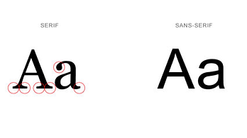
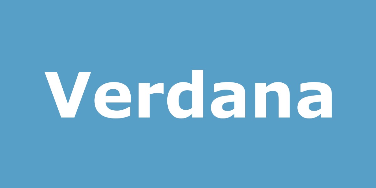
Typography
Our research suggested a clean font that can help users with dyslexia and offer a clean appearance. We decided to use a Sans Serif font and Verdana for their simplicity and easy to read format.
Color Palette
Our color scheme is a testament to the ethos of "uncluttered and tranquil to prevent any sensory overload", with a gentle palette led by baby blue—a hue chosen for its universal symbolism of peace and tranquility.
#8BA9C8
#FFFFFF
#A6A6A6
#000000
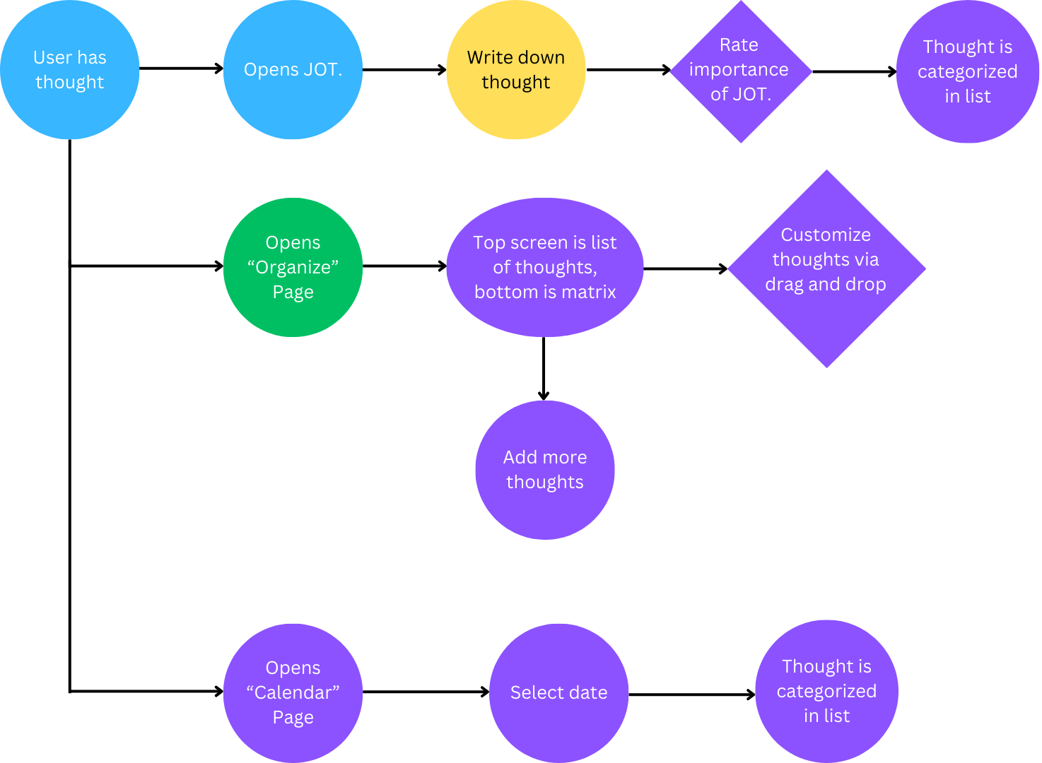
User Flow
Prototyping
Lo-Fi Design
Hi-Fi Design
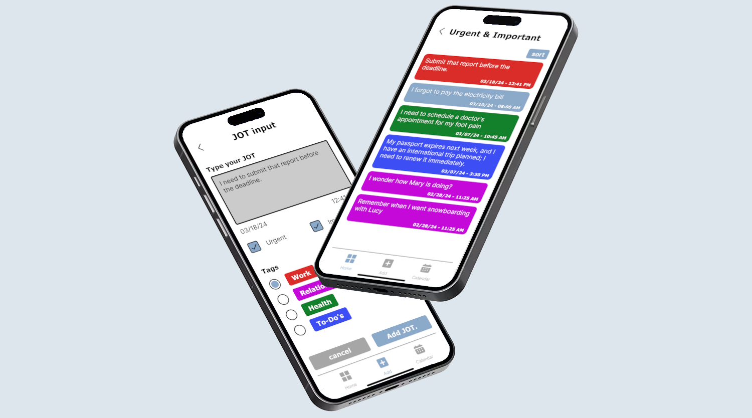
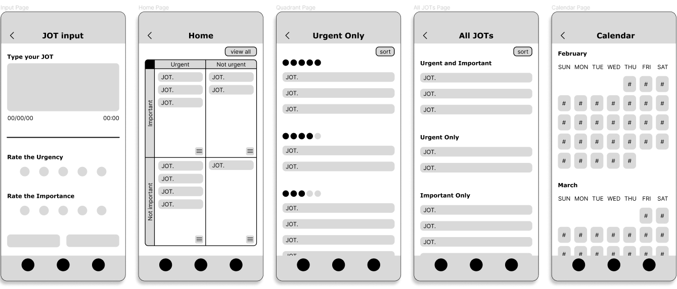
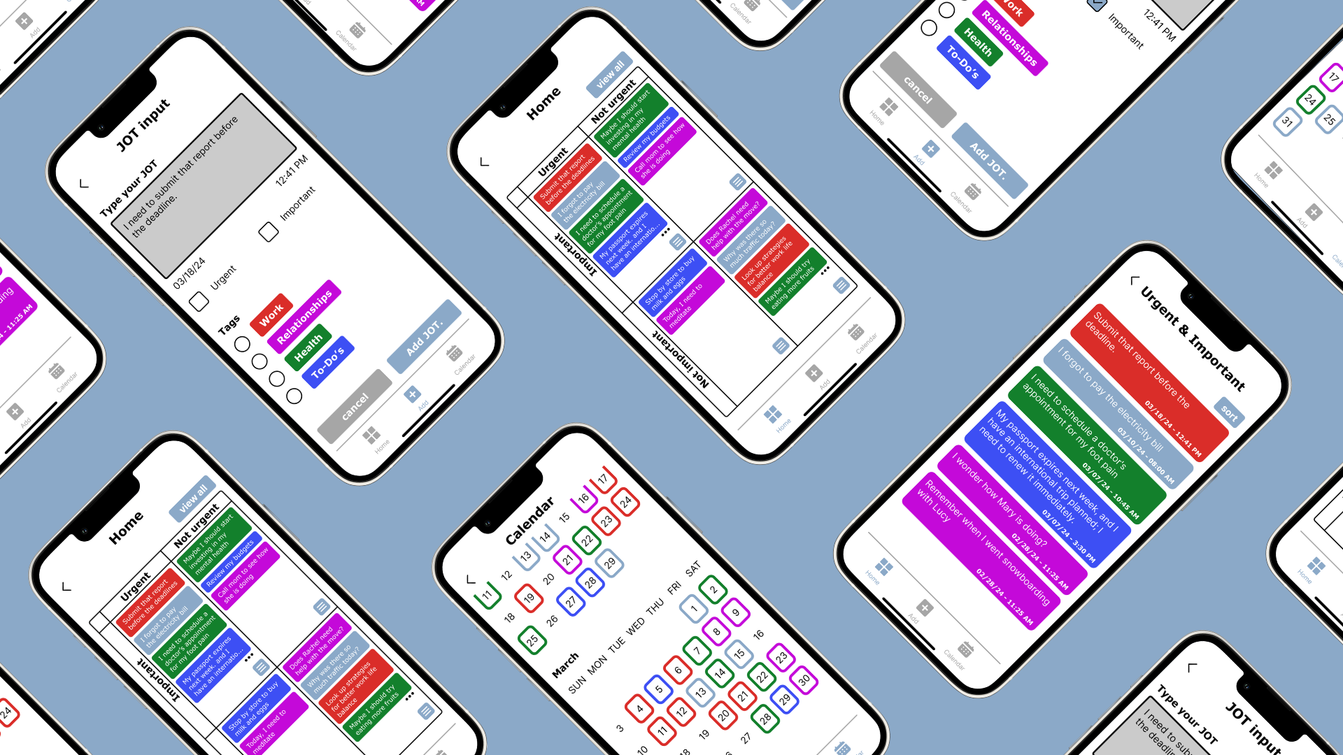
Input Page
The input page is immediately available on launch for quick documentation of thoughts, because in our design philosophy, we envisioned an application that serves as a sanctuary for spontaneous thoughts and emotions—a “brain dump” if you will.
To further enhance the organization, we introduced customizable tags, enabling users to efficiently sort their thoughts into relevant categories such as ‘Work’, ‘Relationships’, ‘Health’, and ‘To-do’s’. This feature not only simplifies the categorization process but also enhances the user’s ability to quickly access and manage their thoughts in a way that aligns with their personal and professional life priorities.
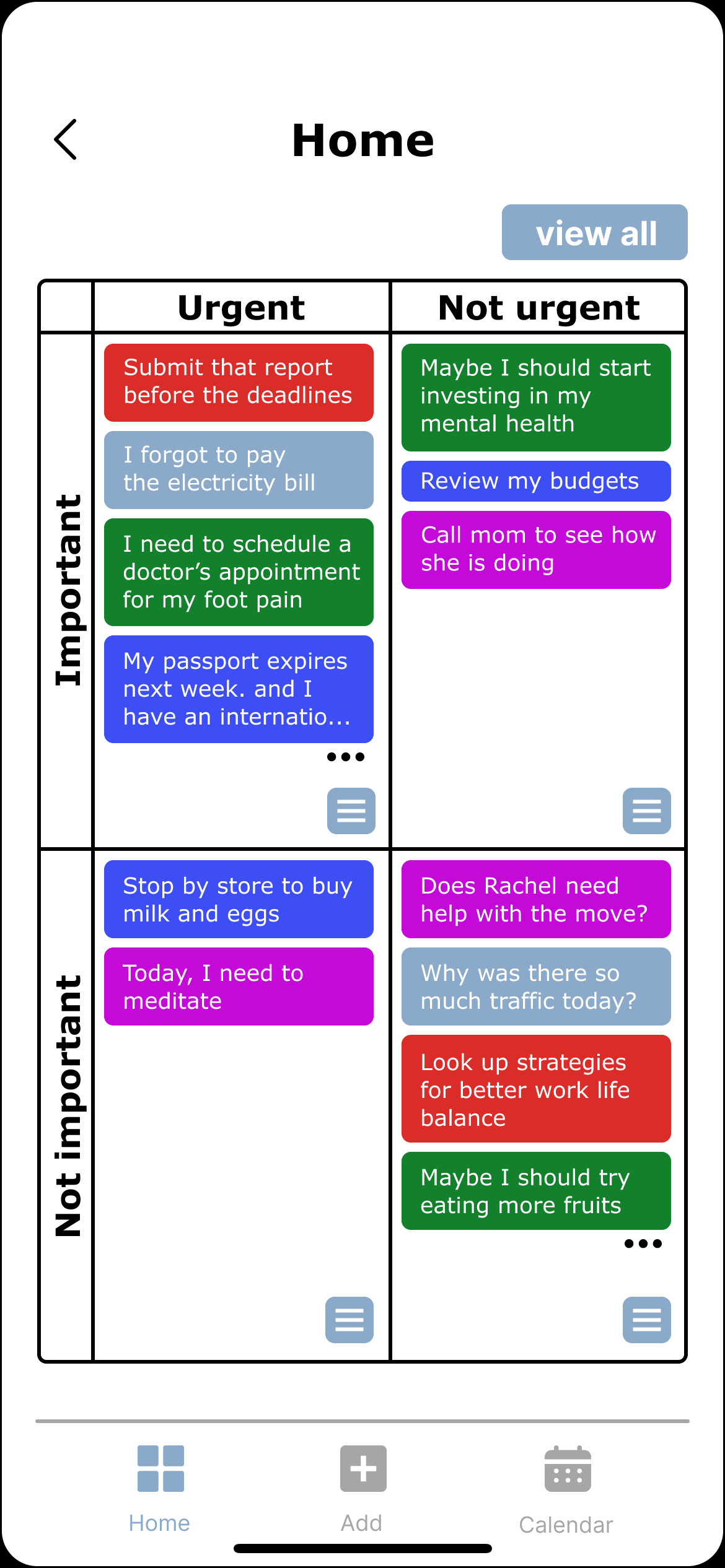
Home Page with Eisenhower Matrix
The Eisenhower Matrix was integrated as a visual framework to classify user thoughts by urgency and importance. This system enables users to sort their thoughts according to a collective rating, providing a clear visual hierarchy of tasks.
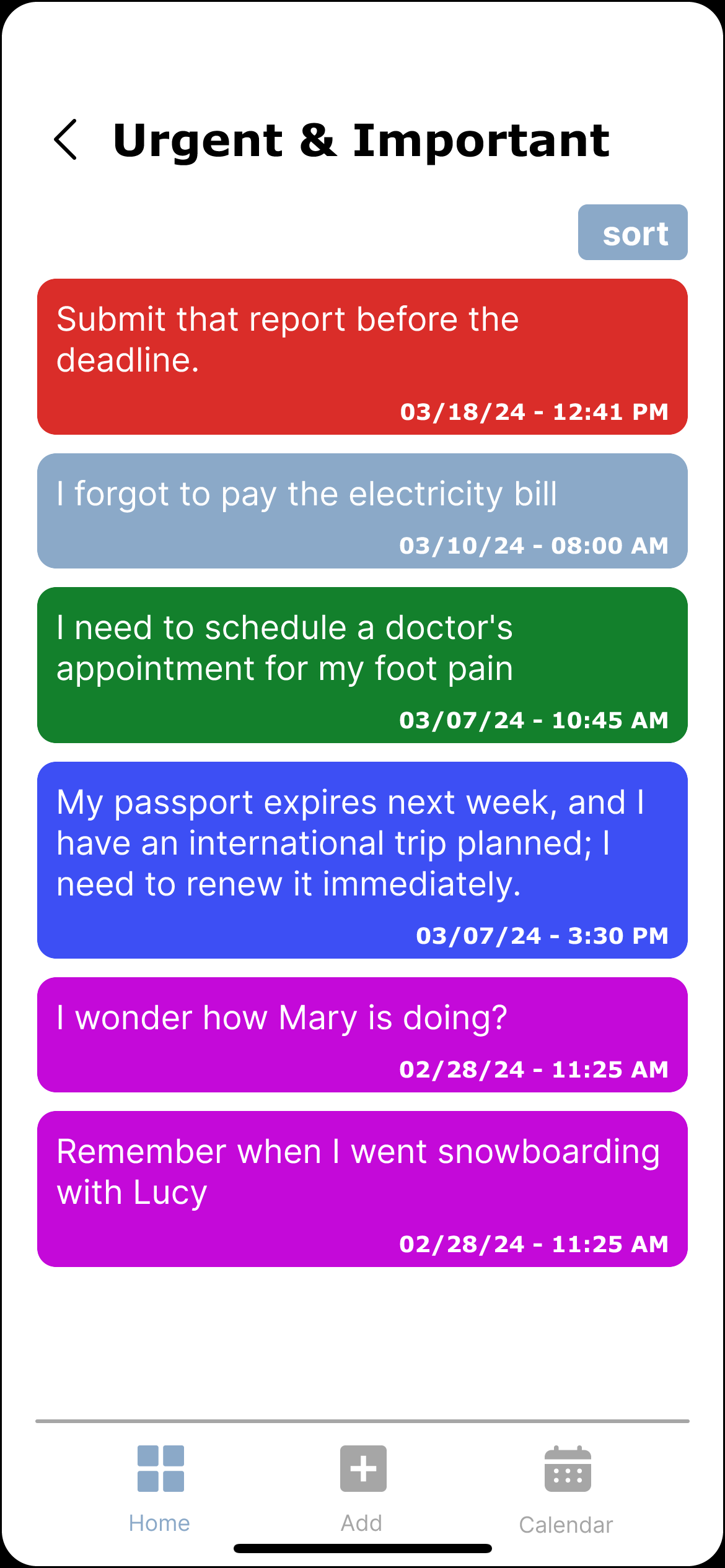
Eisenhower Matrix Quadrants Page
Clicking on a quadrant triggers an expansion, offering users a magnified view of their jots. This expanded space not only provides a clearer view but also introduces a sorting functionality, allowing users to order their thoughts in a way that best suits their workflow
Calendar Page
Additionally, we incorporated a calendar tool, allowing for the chronological tracking of thoughts, thereby offering users a temporal perspective on their ideas and responsibilities. This thoughtful combination of categorization and time-tracking enhances the user’s ability to organize and prioritize effectively.