Redesigned to order smartly
Many universities across the United States use Transact Mobile Ordering app for students to order meals on their smartphones. However, the app's interface is outdated and unintuitive for users. Using the design process, my team and I delievered a redesign of the mobile ordering app is more appealing, intuitive, and functional.
My Contributions:
- User Research
- Problems Analysis
- Redesign
- Prototyping
User Research
Research Goals:
- Identify painpoints in user testing
- Acquire usability, demographic, and quantitative information
- Quantify the efficiency of the existing design
24 students on UC San Diego campus were interviewed.
The participants answered 6 pre-task questions, complete 5 tasks, and answer 2 post-task questions.
Data Analysis
67%
used the app more than once in a week
6.2
average rating out of 10
75%
do not use the non-ordering features
58%
check for allergen information
75%
check the wait times
33%
feel that the wait times are inaccurate
Problems with Old App
1. Endless tapping
To customize their order, users would have to tap through pages of individual menu options, one page for each selection. For example, one page for "patty" choices, one page for "buns", one page for "sauces", and so on...
1
2. Confusing Map Interface
The map on the current app lacks clear indications of the restaurant's name, which inturn makes identifying specific locations very difficult. Furthermore, the pins fail to signify to the users that tapping on the pin will reveal more information, this is a knowledge-based mistake.
2
3. No Food Photos
Without photos, users cannot visually assess the food they want to order. This hinders their ability to make informed decisions of ordering. As a result, they are more prone to making slips and mistakes by selecting a similar sounding item rather than the one they actually desire.
3
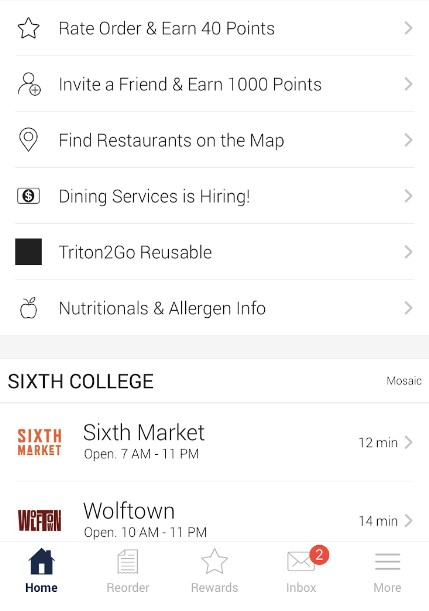
4. Unnecessary Tabs
"Rewards", "Inbox", "Invite a friend", "Triton2go Reusable", "Dining services is hiring" are non-essential to the ordering process.
5. No Remaining Balance
Does not indicate how much dining dollars a user has left on their account. This is an inconvenience for users as they need to place an order without knowing their dining dollars balance or resort to alternative payment methods.
4
Competitor Analysis
Market Research
I researched other mobile ordering apps such as UberEats, Grubhub, and Instacart. Then we defined 4 target variables: simplicity, functionality, customization, efficiency. Lastly, I compared the existing Triton2Go design with each competitor.

UberEats
GrubHub

Instacart

Yelp
How We Rated Triton2Go Based on Competitors
3
/10 for simplicity
- Too many pages of customization
- Complicated ordering process
- No search bar, must scroll and search manually
- Cannot access menu from map
- Requires payment info filled to browse menu
4
/10 for functionality
- Cannot view menu from the map
- Cannot order quantities of item
- Cannot add special notes for orders
- Cannot sort restaurant/menu list
3
/10 for customization
- Limited order personalization
- Only campus restaurants are supported
3
/10 for efficiency
- Map tool is not linked to restaurant menu
- Difficult to locate and navigate to restaurants
- Requires tapping through multiple pages of options
- No ability to order duplicates of the same orders
Re-Designed Prototype
Lo-Fi Design
Hi-Fi Design
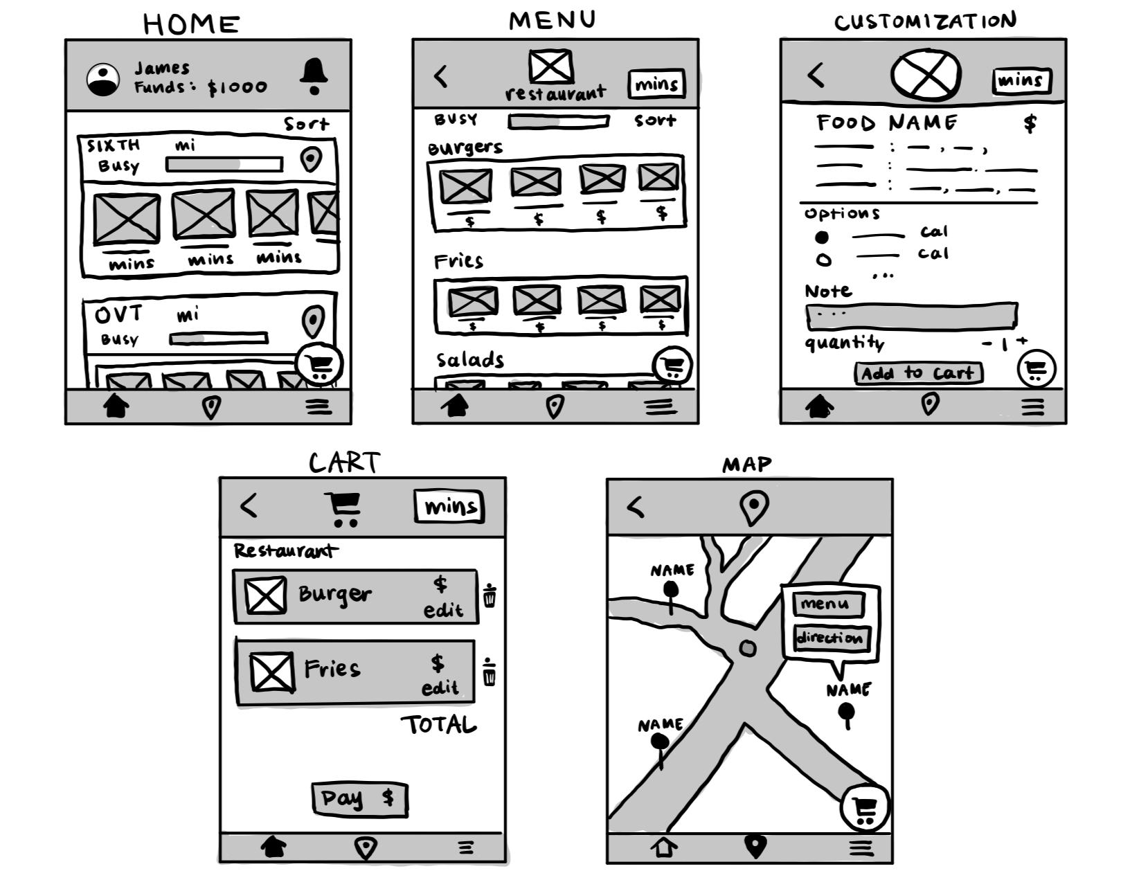
Home Page
By placing users’ available funds front and center on the homepage, our users can make informed decisions about their orders with a clear view of their budget. Next, I crafted a visually engaging gallery of restaurants, each represented by photos that highlights their menu items.
Horizontal scrolling galleries allows for a cleaner layout and an engaging user experience, as it lets users easily navigate through content without overwhelming the visual space.
To elevate user autonomy in the selection process, we’ve implemented a flexible sorting system that prioritizes personal preferences over mere geographical convenience. Each restaurant entry is thoughtfully equipped with a location button, guiding users to a detailed map view with a single tap.
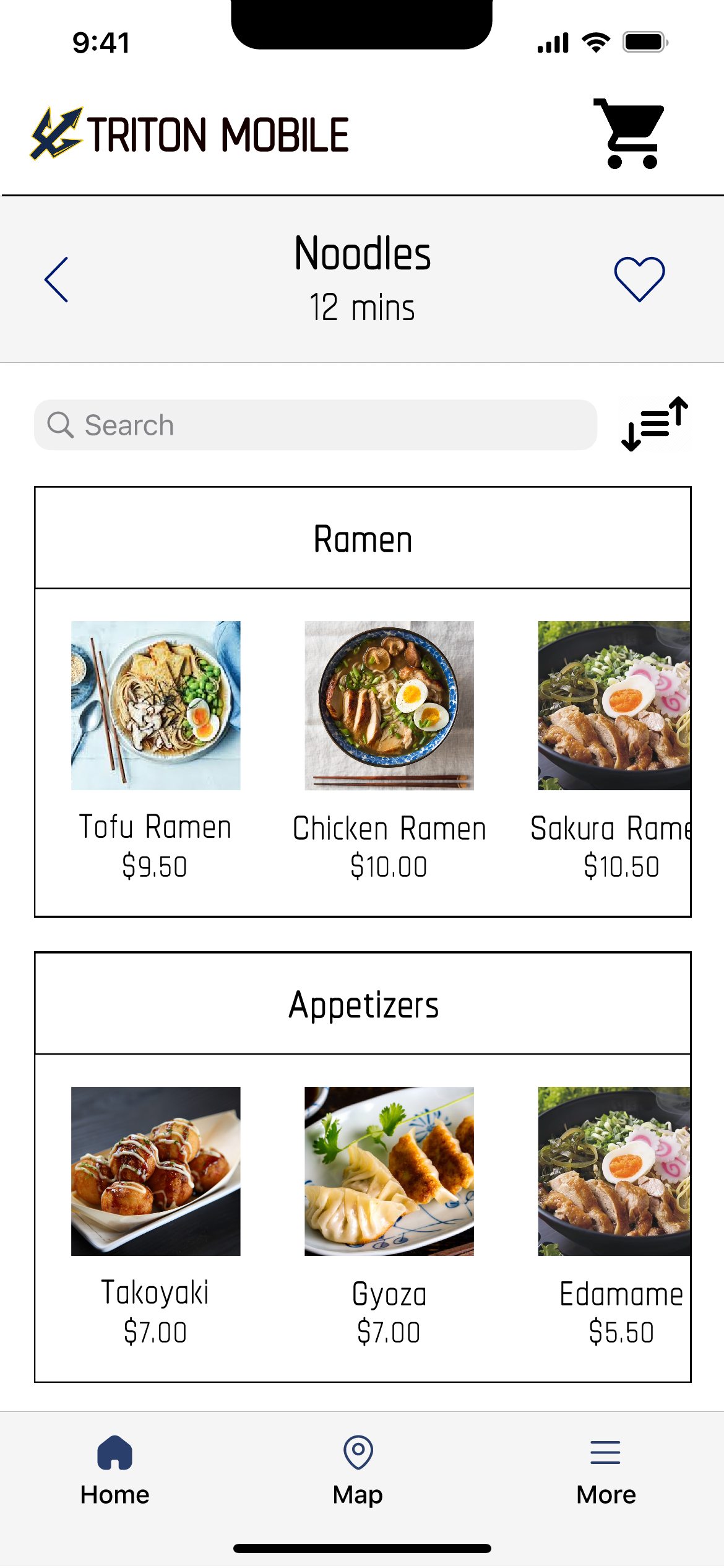
Menu Page
Once a user selects a restaurant, they are navigated to the menu page. Here, we’ve categorized menu items to streamline the decision-making process. Each category is visually defined with photos, offering a glimpse into the dish before delving into the finer details.
Understanding the value of efficiency, we’ve also integrated a search bar, allowing users to swiftly locate their desires. Additionally, a sorting feature enhances the user’s ability to personalize their browsing experience.
To foster a sense of connection and personalization, we’ve introduced the option to "heart" restaurants. This feature not only curates a user’s preferences but also creates a more engaging and tailored interface. Each step in our design process was meticulously crafted to ensure a seamless, intuitive, and delightful experience for our users.
Customization Page
The customization page was designed as a seamless continuation of the user’s journey. After selecting a dish from their restaurant of choice, users are presented with an array of customization options on a single, vertically scrollable page. This intuitive design eliminates the need for multiple taps through various pages, streamlining the customization process into a fluid, user-friendly experience.
Check-Out Page
The checkout page has been refined to enhance user efficiency. Post selection of their desired items, users arrive at a streamlined checkout interface where they can effortlessly adjust the quantities of each item. This marks a significant improvement over the original app’s design, which necessitated revisiting the entire customization sequence to include additional items. Our design solution simplifies the process, saving time and enriching the overall user experience.
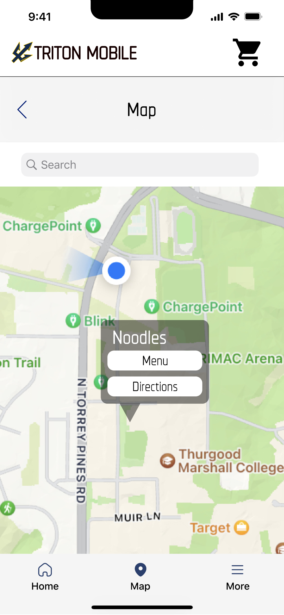
Map Page
The map page, as a pivotal feature, is accessible via the bottom tab or directly through the location icon beside each restaurant on the homepage. It presents an interactive map of the UCSD campus, punctuated with clearly labeled pins denoting restaurant locations.
These pins serve as direct links to the restaurants’ menus, offering users a seamless transition from exploration to decision-making.
Additionally, the provision of navigational directions empowers users to effortlessly find their way to their chosen dining destination. This design iteration focuses on intuitive navigation and ease of access, ensuring a user-friendly and efficient experience.
What the Re-Design Fixed
Streamlined user flow
- Scroll down rather than tapping through pages to customize your order
- Removed features not integral to ordering food
Enhanced Personalization
- Add favorites, filter/sort, and note to chef
- Filter/sort restaurant and menu items
- Send a personalized note to chefs
Easier to find and use map
- Functionality was simplified to two main features; ordering and maps
- Eliminated unnecessary features like the "Inbox", "Rewards", and "Reorder"
- Map button is fixed on the bottom
- Map pins will prompt: the menu of the restaurant, and directions to navigate to that restaurant
Visible photos of the food
- Includes photos of foods
Manage funds easily
- Display remaining available funds
- Ability to add more funds